18. Position and align
Introduction (click any heading below to return here)
CSS style sheets provide you with several methods to align and position objects on your screen giving you full control over the layout of a page. In this module you will learn methods that will allow you to overlay objects on top of each other, create shadows, and even make objects disappear from the screen using just plain old HTML and a few lines of CSS! Have a look at the bar chart below. It was created using a set of <td>s and some very simple CSS instructions. Want to know more?
| Strongly Agree | 37% |
| Agree | 30% |
| Uncertain | 15% |
| Disagree | 7% |
| Strongly Disagree | 11% |
Alignment
text-align: left | right | center | justify;
Sets the text in the object to be either left-aligned, right-aligned, centered, or justified. Applies only to block elements.
td {text-align: center}
{text-align: left} |
this is left justified |
{text-align: right} |
this is right justified |
{text-align: center} |
this is centered |
{text-align: justify} |
Lorem ipsum dolor sit amet, consectetuer adipiscing elit, sed diam nonummy nibh euismod tincidunt ut laoreet dolore magna aliquam erat volutpat. this is justified quis nostrud exerci tation ullamcorper suscipit lobortis nisl ut aliquip ex ea commodo consequat. |
vertical-align: baseline | sub | super | top | text-top | middle | bottom | text-bottom
Sets the vertical alignment of an object.
td {vertical-align:top}
| text is top aligned | example is at left |
td {vertical-align:bottom}
| text is bottom aligned | example is at left |
td {vertical-align:middle}
| text is middle aligned | example is at left |
span {vertical-align:super}
| text is placed as a superscript | basesuperscript |
span {vertical-align:sub}
| text is placed as a subscript | basesubcript |
text-top: Vertically aligns the text of an object to the top of the object.
text-bottom: Vertically aligns the text of an object to the bottom of the object.
float: none | left | right
Sets which side of the object the text will flow. It is important to specify the width of the object being floated.
     none:  Default. Object displays where it appears in the text.
     left:  Text flows to the right of the object.
    right:  Text flows to the left of the object.
This is an example of float. The sphere will float to the left and the cone to the right. Here is the code that produces this result:
<p>
<img src="images/sphere.jpg" style="float:left"
     width="80" height="80" alt="sphere" />
<img src="images/cone.jpg" style="float:right"
     width="80" height="80"  alt="code" />
The HTML following the images will be placed beside the floating
images.Note that the images are aligned to the top of the text.
Lorem ipsum dolor sit amet, consectetuer adipiscing elit, sed
diam nonummy nibh euismod tincidunt ut laoreet dolore magna
aliquam erat volutpat. Duis autem vel eum iriure dolor in
hendrerit in vulputate velit esse molestie consequat.
</p>
|
|
|
 The HTML following the images will be placed inside the floating images.
Note that the images are aligned to the top of the text. Lorem ipsum dolor sit amet, consectetuer adipiscing elit, sed diam nonummy nibh euismod tincidunt ut laoreet dolore magna aliquam erat volutpat. Duis autem vel eum iriure dolor in hendrerit in vulputate velit esse molestie consequat.
The HTML following the images will be placed inside the floating images.
Note that the images are aligned to the top of the text. Lorem ipsum dolor sit amet, consectetuer adipiscing elit, sed diam nonummy nibh euismod tincidunt ut laoreet dolore magna aliquam erat volutpat. Duis autem vel eum iriure dolor in hendrerit in vulputate velit esse molestie consequat.
Float used for page superstructure
Float is also useful for arranging two divs side-by-side. The page superstructure for a left menu and a right side content is a typical job for tables, but CSS3 technology makes this unnecessary and undesirable (tables are for data). Having two blocks side-by-side can be achieved with positioning (which has its drawbacks -- no centering), or with float when the div block containers (one for a menu, one for the content) are styled as inline. Use display:inline to repurpose the divs, and float to push them into place. See how this can be done below: Centering content.
clear: none | left | right | both
Sets whether the object allows floating objects on its left side, right side, or both, so that the next text displays past the floating objects.
 none: Default. Floating objects are allowed on both sides.
 left: Object is moved below any floating object on the left side.
right: Object is moved below any floating object on the right side.
 both: Object is moved below any floating object.
<p>
<img src="images/sphere.jpg" style="float:left"
     width="80" height="80" alt="sphere" />
<img src="images/cone.jpg" style="float:right"
     width="80" height="80" alt="cone" />
This text is contained between the floating images.
<span style="clear:left">The 'clear:left' attribute
inside the 'span' element causes this text to be rendered
below the floating object on the left side.</span>
</p>
|
|
|
|
|
|
Note: This property does not always work as expected if it is used along with the "float" property. For instance 'clear: right' produces the same result as 'clear: left'.
Checkpoint (answer then click)
How do you set the vertical alignment of an object? What are the 'float' and 'clear' attributes?
Centering content
Because horizontal centering content on a Web page is attractive (the current site is centered of course), this topic deserves a section of its own. You have two alternative methods of performing horizontal centering, but because the browsers are in a transitional state, the most up-to-date method of centering with CSS may seem counterintuitive.
Lets begin with centering content by using tables as the parent content container.
Centering tables
This method is not CSS. Rather it utilizes an attribute of the table element. As such it works well on older browsers and will continue to work for many years until the browsers endorse CSS more completely. One draw back is that the centering attribute may not be read or changed by JavaScript, unlike the CSS centering method below.
<table align="center">
    <tr><td>
        All content is placed in td containers
        and will remain in the center of the
        user's browser, regardless of width,
        unless the user narrows the browser's
        window greatly.
    </td></tr>
</table>
Centering divs
Alternative 1 for centering divs
Content is placed in a div which is horizontally centered by setting right and left margin widths styles to "auto". This instructs the browser to automatically calculate equal margins for both sides, thus centering the main div you use to hold the page content. Thanks to Michael Meadhra and Builder.com, August 11, 2004
<head>
<style>
body {
	background-color:rgb(220,220,220);
	font-size:12px;
	font-family:Verdana, Arial, Helvetica, sans-serif;
}
div#outer {
	width: 80%;
	background-color:rgb(255,255,255);
	margin-top: 50px;
	margin-bottom: 50px;
	margin-left: auto;
	margin-right: auto;
	padding: 0px;
	border: thin solid rgb(150,150,150);
}
div#header {
	padding: 15px;
	margin: 0px;
	text-align: center;
}
div#nav {
	width: 25%;
	padding: 10px;
	margin-top: 1px;
	float: left;
}
div#main {
	margin-left: 30%;
	margin-top: 1px;
	padding: 10px;
}
div#footer {
	padding: 15px;
	margin: 0px;
	border-top: thin solid rgb(150,150,150);
}
</style></head>
<body>
<div id="outer">
   <div id="header">
      <h2>Header</h2>
   </div>
   <div id="nav">
   <h4>Navigation</h4>
   <ul>
      <li>Let me not to the marriage of true minds</li>
      <li>Admit impediments; love is not love</li>
      <li>Which alters when it alteration finds</li>
   </ul>
   </div>
   <div id="main">
      <p>Main Content -- Love's not time's fool...</p>
   </div>
   <div id="footer">
      <p>Footer text -- Admit impediments...</p>
  </div>
</div>
</body>
Alternative 2 for centering divs
Declaring "text-align:center" for the containing block-level element (often the BODY element) horizontally centers the div. There is a side effect of this: the CSS "text-align" attribute is inherited, centering inline content. The relevant CSS follows. Thanks to Blue Robot.
body {
    margin: 50px 0px; padding:0px;
    text-align:center;
}
#Content1{
    width:400px;
    margin:50px auto;
    text-align:left;
    padding:15px;
    background-color:white;
    color: black
}
Alternative 3 for centering divs
The div is horizontally centered using a technique proposed to Blue Robot by Simon Coggins. First, the div's left edge is positioned at the horizontal center of the page using "position:absolute; left:50%;". Then, the div's left margin is set to the opposite of half the div's width using "margin-left:-215px; NOTE: 215 is HALF of 400 + 15 + 15".
#Content2 {
    position:absolute;
    left:50%;
    width:400px;
    padding:15px;
    margin-left:-215px;     /* NOTE: 215 is HALF of 400 + 15 + 15".  */
    background-color:white;
    color: black
}
Centering menus and content
Say you wish to place menus in a fixed size column at the left of your main content. This is typical of many pages. To allow the main content to word wrap as the browser window is widened or narrowed, style a relative width for the content div (#ChildRight below) beside the fixed-size menu (#ChildLeft below). For the divs to appear side-by-side, style them display: inline.
body {
    margin: 15px 0px; padding:0px;
    text-align:center;
    background-color: gainsboro;
}
#Main {
    width:80%;
    margin:15px auto;
    text-align:left;
    background-color:white;
    color: black;
}
#ChildLeft {
    display:inline;
    float:left;
    margin-left:-38px;
    height: 100%;
}
#ChildRight{
    display:inline;
    float:left;
    padding: 6px;
}
Hiding content
display: inline | block | inline-block | list-item | none
Sets whether the object is rendered.
      inline: is rendered as an inline element
       block: is rendered as a block element
inline-block: is rendered as a block with adjacent elements on same line *
   list-item: is rendered as a block element,
              and a list-item marker is added (IE6)
        none: is not rendered
* use inline-block to style inline elements that have width or height (IE6)
visibility: inherit | visible | hidden
Sets whether the rendered object is visible.
  inherit: inherits the visibility of the next parent
  visible: is visible
   hidden: is hidden, but rendered

|
| In contrast to the visibility property, display: none reserves no space for the object on the screen. |
|
|
| Unlike the display property, objects that are not visible (visibility:hidden) still reserve the same physical space in the content layout as they would if they were visible. |
Checkpoint (answer then click)
What is the difference between the 'display' and 'visibility' attributes?
Height and width
height: auto | length | %
The height attribute sets the height of a block element, or an inline-block element. Inline elements (span, a, etc.) cannot have height in IE6 unless their display type is styled span { display: inline-block }.
   auto: The necessary height is calculated
 length: Defines the height in px, cm, etc.
      %: Defines the height in % of the containing block

     td {height: 100px;}
width: auto | length | %
The width attribute sets the width of a block element, or an inline-block element. Inline elements (span, a, etc) cannot have width in IE6 unless their display type is styled span { display: inline-block }.
   auto: The necessary width is calculated
 length: Defines the width in px, cm, etc.
      %: Defines the width in % of the parent element's width


   td {width: 470px;}
| Table cell with a width of 470px and a height of 100px |
Width defines the horizontal dimension of block element containers. Common uses are for the Web page body, tables, table cells, lists, divs, and frames. Text flows left-to-right and wraps top-to-bottom within the area defined by width. Width styling is essential for laying out pages that have sections. Blocks that are positioned must have their widths styled. Child elements do not inherit width from parent elements.
There are three optional values for width: fixed, relative, and auto. Width measurement units are: px, cm, mm, in, pt, em, ex (fixed) and percent (relative). The value may be a floating-point number and must be followed by a units specification, for example: 120px or 95%. The third and default value for this style property is auto, the natural width of the object. Auto will cause the element to use the maximun available space.
Relative width:
Relative width supports word wrapped blocks of text whose boundaries conform to the width of the browser window. Browsers opened with wider or narrower windows would display more or less of your text on one line, wrapping lines to a width expressed in the percent value you specify. The percent will be interpreted relative to the parent block element width, usually the page body. Relative width is always specified as a percent measurement.
Combined relative and fixed width:
Many pages are designed using a table superstructure styled for width:100%. The left cell of the table in these cases usually holds a menu column that is given a fixed width (200px is common) and the remainer of the page content is given a relative width:100%. This preserves the critical spacing of menus (on the left) and lets the text content word wrap as the browser screen-width changes. For the table superstructure to fill the entire browser window, style body {margin: 0px }.
Properties that affect width:
You can change the apparent width of a block element by styling its margins, borders and padding. The actual width of the element will not be affected, but the area needed to hold the element (including its content, margins, borders and padding) will increase. The box model for block elements, presented earlier, excludes margins, padding and borders from the block elements width control.
If you have a section that must be a constant 200 pixels wide you should style the outermost container of the section width: 200px and style the inner elements (paragraphs, lists, divs) with padding (padding: 5px) to keep them away from the edges of the 200 pixel block. Do not style the inner elements width the same as (or larger than) the outer section width. If you want a border on the section, style it for the outermost container, where it will add to the container's width. Because 2 pixel borders add 4 pixels of width to the canvas requirements for the 200 pixel section, style the section width: 196px.
Width Cautions:
- It is easy to confuse the style width property (example:
table{ width: 200px }) used in CSS and the width attribute used in HTML markup (example:<table width="200"></table>) since they have the same name. Style width is more powerful and flexible because it can be maintained in the style sheet rather than embedded in the clutter of HTML markup. Also, changing styles to respond to user events (a click, mouse over) with JavaScript is not possible if HTML markup instead of CSS sets the attribute. - Browsers will ignore the width you style for a block that holds content wider than your style. This usually arises with wide images, wide preformatted text, and multiple child blocks whose combined widths are greater than their parent. Normal text (not preformatted) wraps from left to right and top to bottom inside a block.
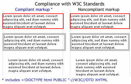
- Compliance or noncompliance with W3C standards changes how the width style you specify will render. Consistent use of
declarations for both testing and production will keep your markup compliant with the standards. Both width and height style properties are compliance issues. Border and padding width are included in the measurement of elements for noncompliant markup, but are excluded (logically) from the measurement of elements for compliant markup. See example 1.<!DOCTYPE html> <html> <head> <html lang="en-US"> <meta charset="UTF-8" /> - Width is not inherited by child elements, but children can influence their parent widths. A child that is wider than the parent element redefines the parent width. The browser reprograms width: 200px to width: auto in this case.This can happen in three common situations: 1. images wider than the parent container, 2. preformatted text, and 3. markup errors in child element(s) width. The sum of widths of all children (left to right) can result in a wider-than-parent situation as well. If you have trouble understanding this, style a paragraph with zero width; the longest word in the paragraph determines the effective width of the paragraph.
Summary of width properties:
- Block or inline: both (see markup below)
- Measurement:
- fixed width: px, cm, mm, in, pt, em, ex. Example: p{ width: 12.44cm }
- relative width: %. Example: p{ width: 90% }
- Inherited: no (but children can influence parent width)
- Required for: positioning
- Alternatives: overflow, transparent pixel spacer
- Also see: box model, padding, margin, border, height, position, and overflow.
Markup width- and width-out compliance
This markup illustrates how W3C standards influence the width (and appearance) of HTML pages. The markup was run with (see left side results) and without (right) the blue declarations. The class .w200 provides visual registration marks for the three 200-pixel paragraphs.
<!DOCTYPE html>
<html>
<head>
<html lang="en-US">
<meta charset="UTF-8" />
<style type="text/css">
body { margin: 5px; padding: 0px; font-size: 7pt; }
p { width: 200px; position:relative; left:0px; top: 0px; }
.a { border: solid red 2px; top:0px; z-index:2 }
.b { border: solid silver 6px; top:-5px; z-index:3 }
.c { padding: 20px; top:-20px; z-index:2 }
.w200 { width: 200px; height: 300px;
border-left: 1px dotted silver; border-right: 1px dotted silver;
position:absolute;top:0px;left:5px;z-index:1 }
</style>
</head>
<body>
<p class="a">Lorem ipsum dolor sit amet, consect .... </p>
<p class="b">Lorem ipsum dolor sit amet, consect .... </p>
<p class="c">Lorem ipsum dolor sit amet, consect .... </p>
<div class="w200"></div>
</body>
</html>
Effect of compliance on width
Non-compliant markup includes the widths of margins, borders and padding in the element width. The effect is subtle in the first paragraph (A) because of the thin border. Compare the second paragraph (B) on the left (compliant) to that on the right (non-compliant) and notice that the silver border is contained within the 200 pixels requested for the paragraph. The left paragraph (compliant) renders as a full 200 pixel paragraph, then renders the silver border as an add-on. The effect is even more apparent in the third paragraph (C) where padding of 20 pixels affects word wrapping; effectively subtracting 40 pixels from the paragraph width on the right.
Alternatives to height and width
Styling with CSS has not been common for most of Web history. Before CSS authors had to rely on block element attributes instead of styles. Tables have width and height attributes that still can be used today. However, you cannot re-style height and width attributes, but you can re-style height and width style properties. In other words, JavaScript cannot rewrite the height="300" attribute of an element, but it can rewrite a style property height: 300px.
In addition to using height and width attributes instead of styling height and width, the pixel spacer has been a popular tool. Setting the one-pixel transparent gif image inside a block element allows you to stretch the element's boundaries by setting the img attribute's height and width. If you need a <td> to be 100 pixels high, place the pixel spacer there and set its height to 100px.
Absolute and relative positioning
You can position objects on your screen by using the position attribute.
There are essentially two types of positioning: 'absolute' and 'relative.' This concept can be confusing because of the names 'absolute' and 'relative.' Both values of the position property really are relative and only control offset. Absolute is relative to its container (usually the <body>), and relative is relative to its position in the normal rendered flow.
position: absolute
To enable absolute positioning on an object you must specify at least one of the top, bottom, left, or right properties, in addition to setting the position property to absolute. The amount of offset is absolutely rendered, usually with respect to the <body>, or to the parent container if it is also absolutely positioned. For example, if you want to have 100% control of where a picture appears, do not place it in any container except the <body>. Also, absolutely positioned objects are removed from the normal flow of rendered material; so, they can easily overlap other material or each other.
Absolute positioning will be relative to the parent container, if it is absolutely positioned, or relative to the body container otherwise. Generally, you can think of the upper left corner of the page as position 0,0. These two numbers are the X,Y coordinates, that is, the horizontal (left-right) and vertical (top-bottom) dimensions. Most absolutely positioned elements are offset from 0,0 of the page by the left (X) and top (Y) pixel dimensions you specify.
position: relative
Setting the property to 'relative' places the object in the natural HTML flow of the document, but offsets (shifts) the position of the object based on the preceding content. It is different from absolute because the reference location is the normal X,Y of the object. Once the object has been laid out according to the normal flow, it may be shifted relative to this normal position. Think of it as shifting objects up, down, left or right to adjust where they appear on pages.
Relative positioning influences the position; it does not control it. For example, to shift an image right 50 pixels, use relative positioning (position:relative; left:50px). To reduce the whitespace above a paragraph by 20 pixels, use relative positioning (position:relative; top:-20px). The main idea is to shift or adjust the position.
When you offset elements like images and paragraphs with position:relative, it has no effect on how the material that follows it is rendered. This concept is unlike position:absolute where the element is removed from the flow of rendered material, allowing that material to flow in place of the element.
Not removing elements from the flow has an interesting, troublesome effect. Since position:relative moves elements, the apparent flow is changed (something is moved), but the calculated flow is not changed. There are positioning examples below to make this clearer.
Absolute positioning example 1
Consider the following CSS code:
    img.pic1 { position: absolute; top: 20px; left: 30px }

    img.pic2 { position: absolute; top: 60px; left: 40px }
| pic1 | pic2 |
 |
 |
The image with class="pic1" is placed 20px down from the top of the document, and 30px to the right from the left side of the document. The image with class="pic2" has a transparent background and is placed 60px down from the top of the document, and 40px to the right from the left side of the document. Absolute positioning gives the programmer full control of the position of an object on screen and is useful when overlaying an object on top of another.
Absolute positioning example 2
Consider the following CSS code:
    img.pic1 { position: absolute; bottom: 30px; right: 40px }

    img.pic2 { position: absolute; bottom: 80px; right: 40px }
The image with class="pic1" is placed 30px up from the bottom of the document, and 40px to the left from the right side of the document. The image with class="pic2" is placed 80px up from the bottom of the document, and 40px to the left from the right side of the document.
Relative positioning examples
Offset text - example 1/2
The following examples have been placed side by side to illustrate the concept of relative positioning.
Consider the following CSS code:
h1 {position:relative; top:-35px; left: 3px;}
The default is shifted 35px up and 3px to the right from its NORMAL position.
h1 rendered in the 'normal' html flow |
The second h1 is positioned relative to its 'NORMAL' position |
Re-positioning to wiggle objects - example 2/2
Use relative positioning to create eye-catching movement. JavaScript is used to handle the mouse events and the re-styling. Learn more about scripts beginning with Lesson 26.
- Links indicated by a button that wiggles
- Links indicated by an image that wiggles

- Links indicated by text that wiggles
onmouseover="
	this.style.position = 'relative';
	this.style.top = '-1px';
	this.style.left = '-1px'"

onmouseout="
	this.style.position = 'relative';
	this.style.top = '0px';
	this.style.left = '0px';"
Absolute & relative compared
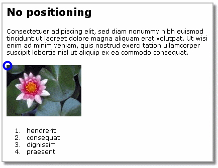
Here is a small plain page with a heading, paragraph, image and list. The blue circle is the where the browser rendered the image.
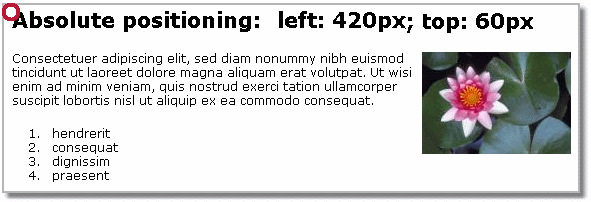
Absolute positioning
Next we will position the image absolutely to X,Y position 420,60. The style is shown below. The red circle represents X,Y of 0,0. This is the left and top-most position on the screen, and the new left and top absolute position is with respect to this position (red circle), not its natural position (blue circle above).
img { position: absolute; left: 420px; top: 60px }
Relative positioning
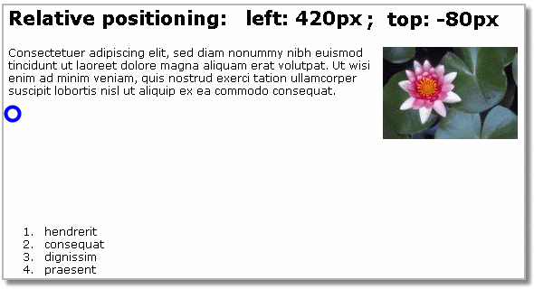
Next we will position the image (relatively) to approximately the same place on the page as the absolute example above. Notice the vacant space left by the positioned image. This is due to the nature of relative positioning. Nothing in the rendering sequence below the object is affected by its new relative position. The style is shown below. The blue circle represents the natural X,Y position where the browser rendered the image. It is this point, not 0,0 as in absolute positioning, that we use to figure how much to move the image to the left and upwards.
img { position: relative; left: 420px; top: -80px }
Coding absolute and relative locations
The table below compares absolute and relative positions that result in an identical placement of four objects. The natural position column shows where the object was rendered before the positioning was styled. The absolute columns show left and top values where the objects will be reloacted, and the relative columns show the corresponding left and top values for using relative positioning resulting in the same location as absolute positioning.
| Natural Position | Absolute Position | Relative Position | |||
|---|---|---|---|---|---|
| X-left | Y-top | X-left | Y-top | X-left | Y-top |
| 0 | 0 | 400 | 100 | 400 | 100 |
| 400 | 100 | 400 | 100 | 0 | 0 |
| 400 | 500 | 200 | 200 | -200 | -300 |
| 100 | 0 | 100 | 500 | 0 | 500 |
Stacking order: z-index
Sets the stacking order of a positioned object. Higher values appear closer to the foreground, lower values appear closer to the background. You can choose the scale to any number that suits you. For instance, a z-index of 100 is more in the foreground than a z-index of 99. Two objects with the same z-index are stacked according to source order. The z-index property only applies to objects that have the position property set to relative or absolute.
<div style="width:300px; height:35px; background-color: gainsboro;
            font-family: Verdana, Tahoma, Arial, sans-serif;
            font-size: 10pt;
            position: absolute; top: 60px; left: 15px;
            z-index: 95; padding:7px">
This paragraph has a z-index of 95</div>
<div style="width:300px; height:35px; background-color: teal;
            font-family: Verdana, Tahoma, Arial, sans-serif;
            font-size: 10pt;
            position: absolute; top: 85px; left: 45px;
            z-index: 75; padding:7px">
This paragraph has a z-index of 75</div>
<div style="width:250px; background-color: transparent;
            font-family: Verdana, Tahoma, Arial, sans-serif;
            font-size: 13pt;
            position: absolute; top: 47px; left: 15px;
            z-index: 165; padding:7px";>
<p style="font-weight:bold; color: red;">This div has a z-index of 165,
         a transparent background and an absolute position</p>
</div>
Checkpoint (answer then click)
Both 'absolute' and 'relative' are really, in fact, RELATIVE. What does this statement mean? When is it best to use one or the other?