39. Advanced graphics
Introduction (click any heading below to return here)
Specialty graphics such as icons, logos, buttons, rollovers, banners and minibanners are seen everywhere on the Web. You have learned the basic skills needed to create and apply effects to your own graphics. In this lesson you will further develop your skills by learning to develop these components.
|
|
The best techniques for creating these graphic components will be explained, and you will learn to create animated GIFs. Finally, you be introduced to a few advanced graphic techniques.
Buttons, icons and shapes
Trademarks
Icons and logos are often treated as trademarks of Web sites. While logos display a title of the site, icons are used to represent links, e.g., home, e-mail, help.
You can use PhotoImpact's Component Designer to create your icons. This tool is useful in that it automatically generates icons and other objects such as banners, separators, bullets, and buttons for you.
- Select Web: Component Designer or press
F12 - Click the plus (+) sign to expand the Icon for template lists and select one.
- Modify the icon; you can change its color.
- When saving, save as Individual Objects
It is better to save the graphics as individual objects because then you are able to manipulate individual parts. You can manage the individual parts by using Layer Manager.
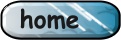
Study the icons above. Only the home icon was generated using Component Designer alone. The e-mail icon was created by using another icon (the e-mail icon) then it was resized and placed inside the triangle frame.
Icon do it

To create the curve use the Path Edit Tool like you have learned for creating margins. The selection and placement of font and text size is very crucial for this logo display. The effect used for this logo was taken from the EasyPalette Lighting Gallery - Fireworks.

This logo uses another effect taken from Lighting Gallery. The text is not changed much; however, it is placed on the bottom-left corner with additional text on the right.
It is helpful to create more than one logo and then pick the best one. The process should help you keep the desirable components of a logo and add additional desirable components. Also, the design should not be limited to the original idea. Change the curvature of the shape or use a different font.
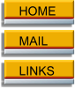
Button bar
A button bar is a collection of uniformly shaped buttons aligned horizontally or vertically and is used for navigating a Web site. The buttons have attributes such as size, shadow, color, text, options and hyperlinks.
The Component Designer is a quick way to create a button bar and the results are also satisfying. The advantage of using the Component Designer is that the button bar is already designed so that you only need to alter the text and color attributes.
 |
 |
|
Creating buttons
To create a button, start with the Component Designer which has more prepared designs available to create buttons than button bars.
The only difference is that you will expand the Button folder instead of Button Bar folder. The next steps are very similar to those for creating a button bar.
Combining basic shapes
You can also create your own buttons by combining basic shapes as you have learned. You can also add some interesting effects to the shapes and the text.
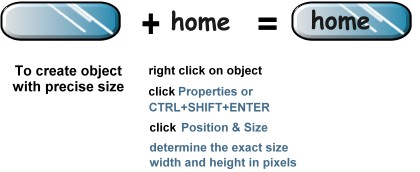
Save your work as UFO (Ulead File for Objects). Doing so allows you to go back and change the text, shapes, or colors whenever you need similar types of buttons.
Select File: Save As or CTRL+SHIFT+S or F4
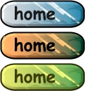
Rollover buttons
Rollovers are buttons whose appearance (such as color, text, shape) changes when the mouse is over them. It is common to have three states of transition: normal (no mouse), mouseover (cursor moving over the image), and mousedown (clicking the image).
You need three images to create rollovers; one for each state of the mouse. To display the rollover graphics use a script written in JavaScript. We covered these scripts in the last Javascript chapter.
A quick way to create rollover buttons is to use the Component Designer and expand the Rollover Button template folder. However, the choices are limited, and it is more interesting to create your own rollover graphics.
|
effects using: EasyPallete Style Gallery - Candle or Helium Painting Gallery - Wisp pattern |
Checkpoint (answer then click)
- What is the easiest way to create buttons in PhotoImpact?
- What are the general steps for creating rollovers?
Banners
Banners are a popular means of advertising Web sites and products on the Web. There is no doubt that banners are popular for increasing product awareness and promoting brands on the Web.
Most of us notice the banners, but few will click and follow the links. Therefore in general banners are best for keeping the brand name or company name familiar to users. In other words, don't count on getting rich by the clicks generated through banner advertising.
Guidelines for banners
Adopt a standard size and stay with that size. The average size is 486x60 pixels with a recommended file size of 8KB or less. Use logos and other art you already have in use. Doing so helps keep brand familiarity.
Use attractive colors to enhance appearance or use discrete (subtle) animated GIFs. These are popular and can be effective for banners. Animated GIFs are covered after banners. Save the banners in any of the Web formats (JPG, GIFs and PNG).
Banner techniques
It is possible to create banners using Component Designer and this process is explained in PhotoImpact Banners Tutorial. After the banner is created by selecting options from the Component Designer, you can modify or add some more interesting objects to it.

The Component Designer creates the major art of the banner. You can make some modifications by adding a flower object taken from the Stamp Tool. The bottom and right border are filled with the same color as the top part (use the Color Picker Tool) to resize the banner to 486x60 pixels.
Try using the Component Designer, and then customize your banner.

Tips to design your own banners:
|
Minibanners
Minibanner size is on average 140x32 pixels and depends mainly on each company's policy. They usually display small versions of the company logo and name.
The common approach to designing minibanners is to create large graphics for the minibanner then make the graphic smaller by changing dimensions. However to make the text crisp, do not plan to reduce the size of text. Reduced size text often blurs, so wait until your minibanner art is the correct size then add text.
Try to design your own minibanners -- here is a simple icon and a phrase inside a box.
You can create animation for your banners and minibanners using GIF animator. You will learn how to animate your GIFs next.
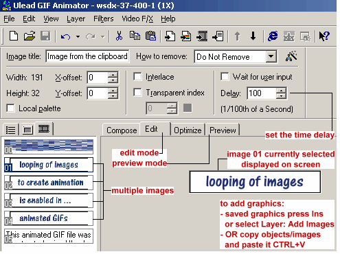
Animated GIFs
Animated GIFs using the GIF89a technology enables looping process so that multiple graphics can be displayed sequentially and repeatedly.
You will need to open Ulead GIF Animator. For practice save this animated gif on your images folder and open it using Ulead GIF animator.
Let's analyze the above text graphics for a moment. It has four different phrases with each being timed almost equally one after the other. Also recognize that there is a loop to display the first phrase again right after the fourth.
Once you can make this analysis, the rest is really simple. Animated GIFs must be multiple images displayed one by one after a certain time delay. Remember these two crucial points:
- you have to have several graphics
- you need to determine the time delay for each graphic
Ulead GIF Animator
Steps to use GIF animator
|
Banner exercise
Create a banner with your name as the title by using the Component Designer
- add appropriate effects to your text
- add four or more graphic objects to your banner such as icons and separators
- save the banner as Individual Objects
Checkpoint (answer then click)
- What should you consider when making banners and minibanners?
- When are animated gifs useful?
Slicing
Slicing images is ideal if you have photographic elements (ideally saved as JPG) and text elements (ideally saved as GIF). You can save the images in two different formats, depending upon the content of your image, to achieve smaller file size and faster download time. If you do not have different content areas, slicing can make downloading appear faster since users see parts of the image sooner. Interlacing applies this effect for you automatically, but it requires somewhat larger files.
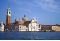
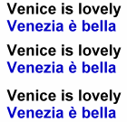
Here is an example graphic that consists of a photo with text next to it. The graphic can be saved as two separate graphics with different formats, or as one.
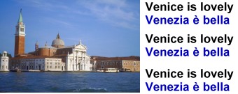
- Saved as JPG 90 % quality, file size 17.2 KB
- Sliced and saved as two images with a total for both files 12.88 KB
- Photograph saved in JPG 90 % quality 7.48 KB
- Text saved in GIF 5.40 KB
Image slicer
Slicer divides the image into specified slices using either horizontal or vertical lines. You will also have the option to slice image evenly based on how many rows and columns you desire.
There is one limitation of PhotoImpact Slicer. You cannot save each individual slice; rather you have to save all sliced images together as one Web page. Your sliced image will be saved in the images folder from the root directory where you save.
To slice image:
- Select Web: Slicer.
- Click Add horizontal (or vertical) sliced lines. Hold and drag the mouse to draw the lines.
- Repeat step 2 to add more lines as needed. To remove a line, click Erase sliced lines.
- Once finished, rename all the sliced images in the Image Name.
- Select the file format for each sliced image, click Image Optimizer for further customization.
- Click OK. To preview click Preview in Browser.
- Select File: Save for Web - As HTML to save as a Web page along with all the associated image files.
Bargain graphics
If you lack talent with a graphics editor, you still can enjoy some graphics on your Web pages by purchasing them or finding graphics that are free. To remain safe from prosecution you must never presume that free graphics are free of restrictions or conditions.
Below is a list of Web sites that offer free graphics. They are free in the sense that you do not have to pay, but they are not free from conditions. Always seek out and read "conditions of use" if you are tempted to freeload someone's art.
If you find good art and can agree to the conditions, download the art and place it on your server. Never link to the image on the artist's server. This practice is called stealing bandwidth since you would be asking the other server to serve the image instead of asking your server for the image. There are methods available to Webmasters for tracking down bandwidth violators.
Free graphics
Yes, free graphics are right under your nose. They come inside PhotoImpact: galleries of art that they intend for you to use and modify as you wish. So for the price of the graphics editor (less than $80) you get a bunch of free art.
You really do not have to understand very much about the editors to obtain the graphics. Here are some samples from PhotoImpact, and directions for finding them in the package.
Banner
|
|
On the PhotoImpact menu bar select Web, Component designer. You will find hundreds of free graphic components like these, and a great Wizard to help guide you through customization. |
Checkpoint (answer then click)
- What is the benefit of slicing images?
- Are we allowed to use graphics that we see on the Web?
- What is meant by stealing bandwidth?
Home page exercise
Design and create the following graphics for your personal home page:
- your own logo: it can be simply your name and a virtual company name
- rollover buttons for navigation or pop-ups
- useful icons to identify locations within your site
- your own banner: place the banner that you create in the previous checkpoint; you can also create a new and better one
- animated icons or banners: add simple animation to enliven the page; however, this should not be distracting from the content
Create a home page to display the graphics and make sure that it works properly. Test the rollovers.